
TapSenior is proud to officially announce a meaningful transformation in its brand identity with the introduction of a new logo, effective March 30, 2026. This change is not simply a visual update, but a deep reflection of the values, mission, and long-term vision that TapSenior carries as it continues to grow as a global ecosystem dedicated to serving seniors with dignity, compassion, and innovation. As TapSenior expands its presence across Canada, the United States, and beyond, this new logo represents a renewed commitment to human-centered care, community connection, and the belief that every senior deserves to live with comfort, respect, and independence.
From its foundation, TapSenior has evolved as more than just a service provider. It has become a comprehensive platform that integrates multiple essential services tailored specifically for seniors, including mobile beauty services, senior transportation services, home cleaning and housekeeping services, caregiver support, and technology assistance for seniors. Each of these services addresses a real and growing need in modern society, where aging populations require more flexible, accessible, and personalized solutions. The new logo is designed to unify these services under a single emotional and visual language, one that communicates empathy, trust, and reliability at first glance.
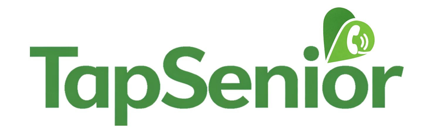
At the heart of the new TapSenior logo lies a powerful symbol: a heart-shaped location marker combined with a communication element. This design carries profound meaning. The heart represents compassion, care, and emotional connection, which are core values of TapSenior’s service philosophy. It reflects the company’s belief that serving seniors is not just about completing a task, but about delivering care with sincerity and respect. The location pin symbolizes mobility, accessibility, and the ability to bring services directly to where seniors are, whether that is their home, a hospital, a senior residence, or any place where they feel most comfortable. This is especially important for services such as mobile beauty for seniors, in-home nail care, mobile haircut services, and bedside grooming services, which are designed to eliminate the need for seniors to travel.
The communication symbol embedded within the logo represents connection. It highlights TapSenior’s role in bridging the gap between seniors, families, and service providers. Through services like senior transportation, caregiver coordination, and technology support for seniors, TapSenior is not only delivering services but also building a connected ecosystem where seniors are never isolated. This is particularly relevant in today’s world, where loneliness and lack of access to services can significantly impact the quality of life for older adults.
The decision to redesign the logo was driven by a deeper realization that TapSenior is entering a new phase of growth and impact. As the organization expands into new cities and countries, the brand must communicate not only professionalism and scale but also emotional depth and purpose. The previous identity, while functional, did not fully capture the essence of TapSenior’s mission, to serve with compassion, integrity, and a sense of responsibility toward the community. The new logo is a deliberate step toward aligning the visual identity with the soul of the brand.
One of the most important aspects of the new logo is its color palette, with green chosen as the dominant color. This choice was made with careful consideration and carries multiple layers of meaning. Green is universally associated with life, renewal, and growth. It reflects the idea that aging is not a decline but a stage of life that can still be vibrant, meaningful, and full of opportunities. For TapSenior, green symbolizes the continuous growth of both the seniors it serves and the ecosystem it is building. It represents hope, positivity, and a fresh perspective on aging.

In addition, green is closely linked to health and well-being, which aligns perfectly with TapSenior’s services such as in-home care, mobile beauty services, and wellness support. When seniors see the TapSenior logo, the green color subconsciously communicates safety, calmness, and trust. It reassures families that their loved ones are in good hands. In a competitive landscape where many service providers focus primarily on convenience or pricing, TapSenior differentiates itself by emphasizing emotional value and human connection, and the color green reinforces this positioning.
Another reason for choosing green is its association with balance and harmony. TapSenior’s services aim to create balance in the lives of seniors by providing support that allows them to maintain independence while receiving the care they need. Whether it is a mobile manicure and pedicure service for seniors, a reliable senior transportation service to medical appointments, or a caregiver assisting with daily activities, every service is designed to bring stability and peace of mind. The green color visually represents this balance, making it an ideal choice for a brand that operates at the intersection of care, technology, and community.
The new logo also reflects TapSenior’s ambition to become a global leader in senior services. As the company continues to expand into international markets, including major cities across Canada, the United States, the United Kingdom, Australia, and Singapore, having a strong and meaningful brand identity is essential. The logo must resonate across cultures while maintaining a consistent message. The universal symbols of a heart, a location marker, and communication waves ensure that the logo is easily understood and emotionally impactful regardless of language or geography.
Beyond aesthetics, the logo change signals a strategic shift in how TapSenior positions itself in the market. It is no longer just a collection of services but a unified ecosystem that connects various aspects of senior living. Through TapSenior, families can access mobile beauty for seniors, senior transportation services, home cleaning for seniors, caregiver support, and even technology assistance, all within a single integrated platform. This holistic approach is what sets TapSenior apart and allows it to deliver a seamless experience for both seniors and their families.
The logo also plays a crucial role in building trust. In industries such as senior care, trust is not optional—it is essential. Families need to feel confident that the services they choose are safe, reliable, and delivered by professionals who genuinely care. The new TapSenior logo is designed to evoke this trust instantly. Its clean design, meaningful symbolism, and calming color palette work together to create a sense of reassurance and credibility.
Furthermore, the redesign reflects TapSenior’s commitment to innovation. While the company is deeply rooted in human values, it also embraces technology to improve service delivery. From online booking systems to digital membership cards and coordinated service platforms, TapSenior integrates modern technology to make services more accessible and efficient. The communication element in the logo subtly represents this technological aspect, indicating that TapSenior is not only about care but also about smart solutions that enhance the user experience.
As TapSenior moves forward with this new identity, it also aims to inspire a broader cultural shift in how society views aging. Too often, seniors are seen as a group that needs assistance rather than individuals who still have value, wisdom, and potential. TapSenior challenges this narrative by creating services that empower seniors to live independently and with dignity. The logo embodies this philosophy by combining strength and softness, structure and emotion, functionality and meaning.
The introduction of the new logo is also an invitation to the community. It calls on partners, service providers, and families to join TapSenior in its mission to create a more compassionate and supportive environment for seniors. Whether it is a technician providing mobile nail services, a driver offering senior transportation, a caregiver assisting with daily needs, or a volunteer teaching technology skills to seniors, everyone plays a role in this ecosystem. The logo serves as a symbol that unites all these efforts under a shared purpose.
In conclusion, the TapSenior logo change effective March 30, 2026, marks a significant milestone in the company’s journey. It is a reflection of growth, a statement of values, and a vision for the future. More than just a design, it is a representation of TapSenior’s commitment to compassion, integrity, and social impact. As the brand continues to expand and evolve, this new logo will stand as a reminder of why TapSenior exists—to serve seniors with heart, to connect communities, and to create a better world where aging is embraced with dignity and care.
TapSenior Canada
Bài viết liên quan: